
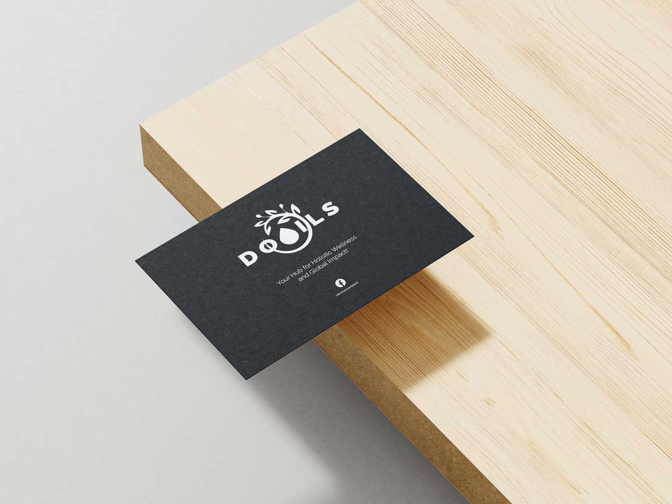
Let's Do Oils Logo
This logo was created as part of the Let’s Do Oils Branding. Minimalistic yet impactful design that encapsulates the essence of essential oils and natural wellness. The design features the text “Do Oils” with an innovative twist—the letter “o” is replaced by an oil drop symbol. Encircling the text is a delicate, circular flower-like pattern, adding an organic touch to the overall aesthetic. This versatile logo works perfectly across various media and helps establish a strong, natural brand identity.
Project Highlights
- Minimalistic Design: Clean and simple, ensuring immediate brand recognition.
- Innovative Symbolism: The oil drop replaces the letter “o,” emphasizing the product’s essence.
- Organic Accent: A circular, flower-like pattern adds a natural and elegant flair.
- Versatile Branding: Suitable for digital, print, and merchandise applications.
- Reflects Natural Wellness: Perfectly captures the brand’s focus on essential oils and healthy living.